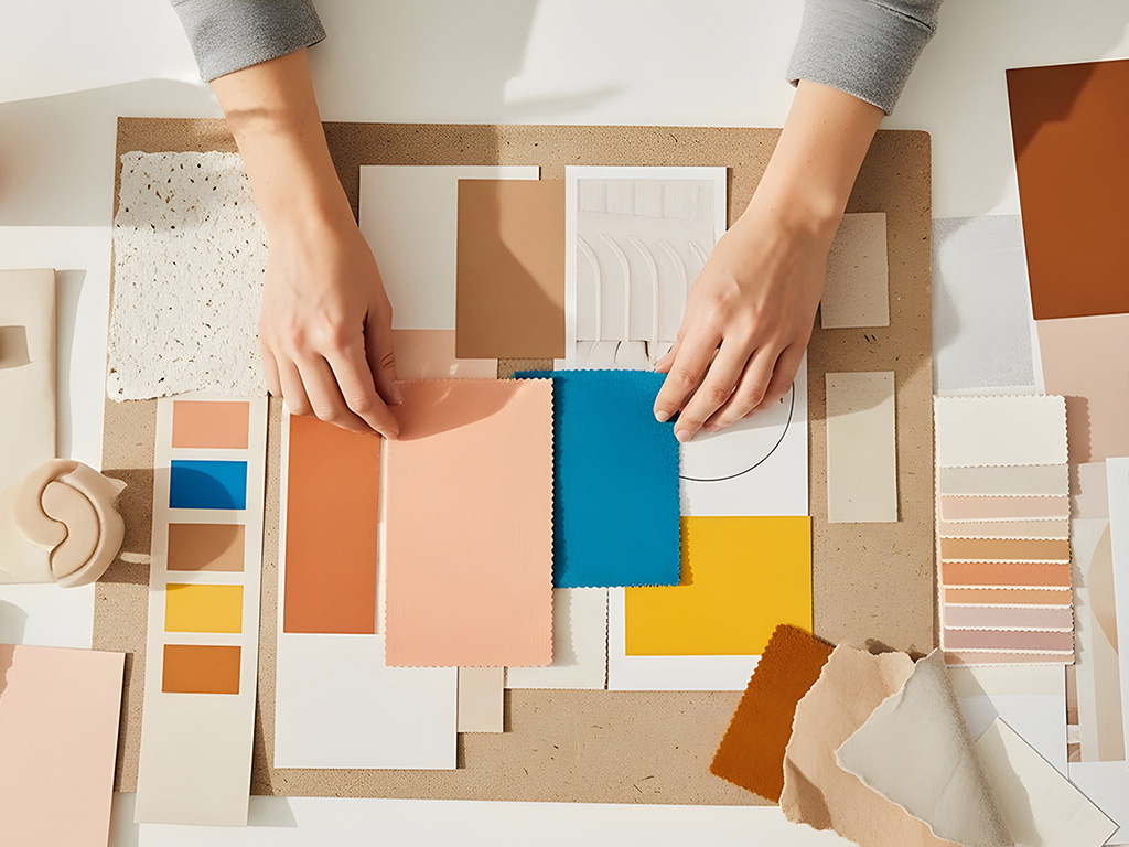
Mood rings used to tell you how you felt.
Mood boards tell you how a campaign or brand should feel. Close, but not the same…
Similarly, if you’ve ever sat in on a creative or dev conversation, you’ve probably thought:
Wait… aren’t those the same thing?
Why are there six words for one concept?
What does “frontend” actually mean?
Design and development come with a lot of overlapping terminology. Sometimes words are interchangeable. Sometimes they’re very different. And knowing which is which saves time, confusion, and about 47 Slack clarifications.
So here’s a quick decoder for the language we use at TRJ.
Creative & Visual Terms
These all live in mood boards, style guides, and brand systems, basically, anything that defines how something looks and feels.
Visual elements / design assets
Two phrases for the same idea.
These are the building blocks of a brand; icons, graphics, photos, illustrations, patterns, buttons, logos. If it’s a visual component you place into a design, it’s an asset/element.
Color palette / brand colors
Also interchangeable.
This is your approved set of colors. Not “whatever looks good today,” but a defined system that keeps everything consistent and recognizable.
Same concept, different phrasing depending on who’s talking.
Type / font
Designer vs. everyday language.
Designers often say type or typeface. Most people say font. Either way, we’re talking about the lettering styles that shape how your content looks and reads.
Different words. Same thing.
Brand identity / visual identity
These are close, but not identical.
Brand identity = the full personality (voice, tone, messaging, visuals)
Visual identity = just the look (colors, fonts, imagery, layouts)
So one is the whole story.
The other is specifically the aesthetic.
They overlap, but they’re not exact synonyms.
Visuals / design / artwork / assets
You’ll hear these tossed around casually, and honestly, they’re often shorthand for the same bucket: “the creative stuff.”
In conversation, they’re usually interchangeable.
Development Terms
Now we switch from how things look to how things work.
Frontend / site visuals
The user-facing side.
What people see, click, scroll, and interact with. Layouts, pages, buttons, animations aka the visible experience.
Backend / code / site data
The behind-the-scenes side.
The logic, databases, and systems that power everything. Users don’t see it, but nothing works without it.
Different responsibilities. Same project.
Someone who handles both?
That’s a full-stack developer.
Project Status Terms
These don’t describe what something is, they describe where it lives.
Local / not live
Work happening privately on a developer’s machine or on a private server.
Not visible to the public yet. Safe for testing and experimenting.
Same goals, shared language
At the end of the day, most of these terms aren’t meant to sound technical or exclusive. They’re just shorthand.
Different team members. Different specialties. Slightly different vocabulary.
But they’re all pointing to the same goal:
Create something that looks great, works smoothly, and launches confidently.
So next time you hear assets, visuals, frontend, backend, or production flying around a meeting, you’ll know exactly what we mean.
Mood boards set the tone.
Terminology keeps everyone aligned.
And honestly? That’s way more useful than a color-changing ring.
And if you need help putting any and all of these terms into practice, we happen to be available, with an extensive working knowledge of all this vocab.