Challenge
Previously known as IPI, the company was ready for a new identity that would help distinguish it from another local business with a similar name. Beyond avoiding confusion, they wanted the new brand to better reflect who they had become, including their values, approach, and the experience they wanted clients to have.
Solution
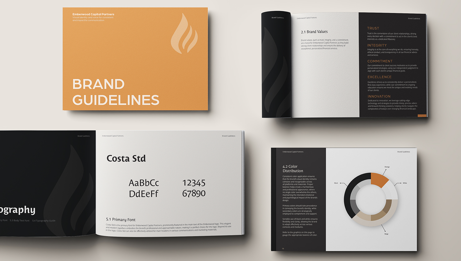
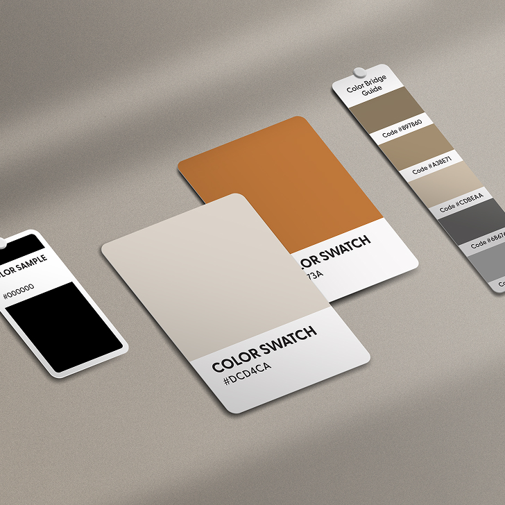
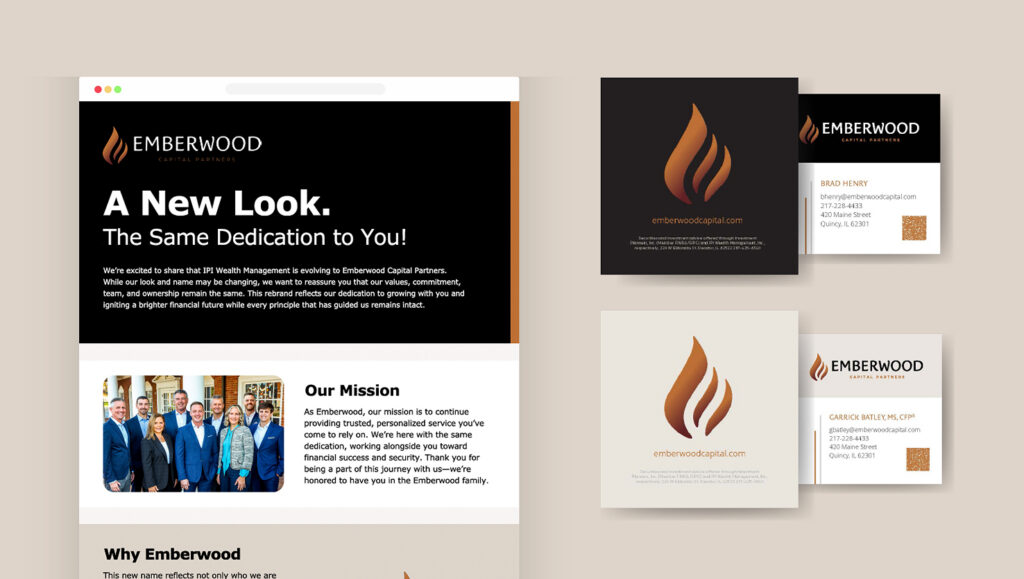
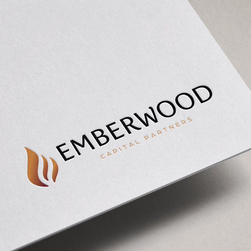
The Relish Jar helped shape the rebrand from the ground up, beginning with the Emberwood name and continuing through logo development and a complete visual identity. The new brand was designed to feel established, confident, and distinct, with clear standards for how it should appear across a variety of platforms and materials.
The Relish Jar also helped bring the new identity to life through website design and development, along with internal marketing materials used by staff. The result was a cohesive brand system that gave Emberwood a stronger presence and a more unified way to communicate both internally and externally.