Challenge
Tracy Family Foundation had an established visual identity, but without comprehensive brand guidelines, colors, fonts, and design elements were being applied differently depending on who was creating the materials. They needed a clearer system to create a more consistent look, feel, and message across the organization.
Solution
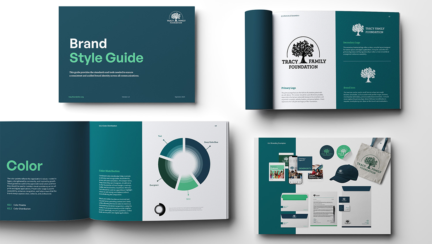
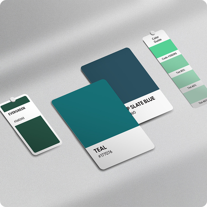
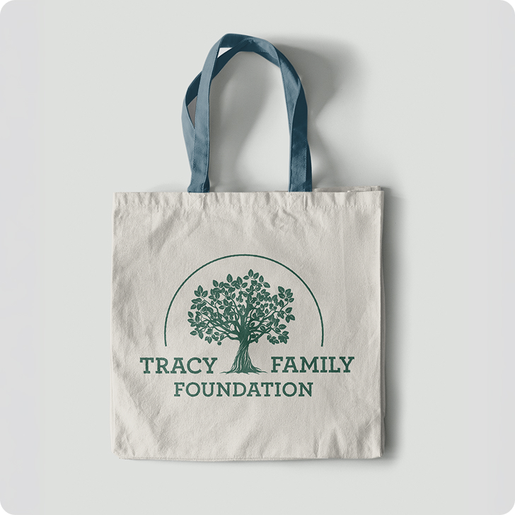
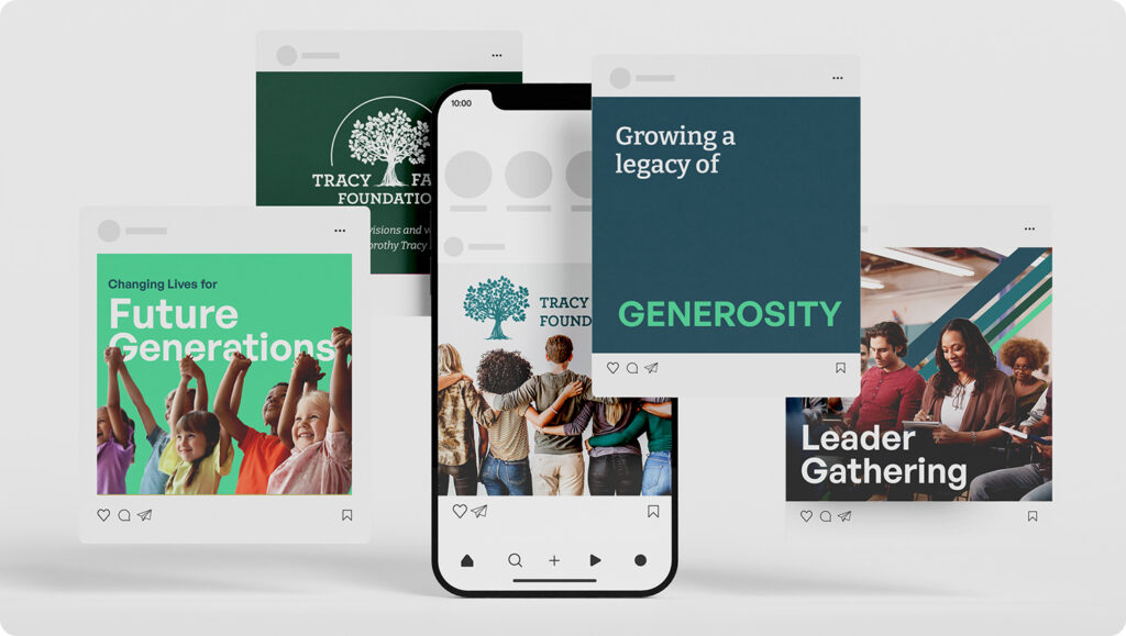
The Relish Jar built on the foundation already in place, refining the brand and developing detailed guidelines for how it should be used. From typography and color standards to logo applications and real-world use cases, the finished guide gave their team a practical framework for creating cohesive, recognizable materials across every touchpoint.